"You can have the greatest message in the world, but if you don't sell it, it's not going to get anywhere."
Can you tell us about the inception of the Progress Pride Flag?
Daniel Quasar
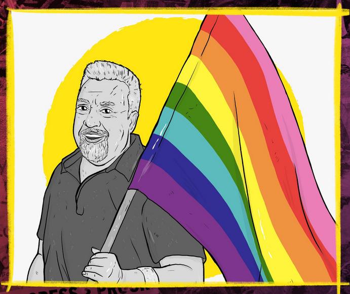
Okay, so it's 2018. And it's June 4th or 5th. Super early in the morning, that's when I do all my best work. A few days before, Seattle had introduced a version of the Pride Flag. This new flag had all 11 stripes just stacked on top of each other, and I looked at it as a designer and thought, I love what they're going for, I just don't like how they executed it. I believe execution is really important. It's why design exists. You can have the greatest message in the world, but if you don't sell it, it's not going to get anywhere. Anyway, one of my best friends was online with me, and I was bouncing the ideas off her. Around three o'clock in the morning, I wrote up my original post about the Progress Flag on Facebook and Instagram, then went to bed. I woke up to probably the most anxious day of my entire life. My phone would not stop beeping every four seconds. My phone died like three times that day, just from how many times was getting notifications. I'd gone viral. The rest is history; it grew into what it is now, it just kept growing and growing, and it's still growing.
Can you tell us about the significance of design and colours?
Daniel Quasar
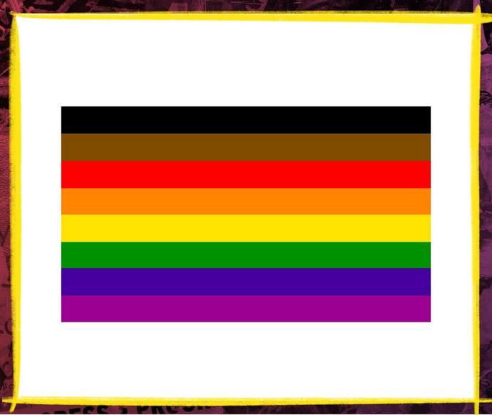
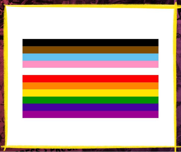
I wanted to highlight that probably the most underprivileged and most scrutinised group in the entire LGBTQ community is Black trans women. The pink, white and blue stripes are from Monica Helms' Trans Pride flag. The black and brown stripes show racial equity and the need to pay more attention to the communities of colour within the queer community and show their value to the group. The black stripe in my design also represents people living with HIV and AIDS, a riff on a design from the late 80s (the Victory Over AIDS flag). Finally, the traditional pride flag of the six stripes, which was one of Gilbert Baker's original designs. The Progress pride flag has its own meaning in terms of acknowledging that there are things in our community that we need to progress on because we're not progressing enough. At the same time, it's a very clear history of who we are because it pulls from so many things throughout the history of the community.
What would you say to someone who wants to designer their own flag?
Daniel Quasar
Go for it. I feel like the queer community is in a very interesting period of flux right now. We're trying to figure out how we identify ourselves. What are our symbols? I think that nobody should gatekeep that and stop somebody who wants to carve out an identity within a community that is all about finding your own identity.
What do you think about using a rainbow to represent the LGBTQIA+ community?
Daniel Quasar
I love the rainbow symbol. I think the rainbow symbol is beautiful. I think what it was made to represent is beautiful. And I think it has intrinsic value because of that. There are a lot of people in the community who see that symbol, and they don't see themselves. You know, a lot of queer people of colour, a lot of trans people see that, and they see violence because the queer community is very racist and it's very white-centric. It's very sis centric. So it's a great symbol that has flaws.
" I think the rainbow symbol is beautiful. I think what it was made to represent is beautiful."
Can you tell us about the Progress Initiative?
Daniel Quasar
I decided that the creation of this flag was going to give back to the community. I can say, here's the Progress Pride Flag, and then the Progress Initiative. I want to show action in conjunction with the creation of my design.
And how do you go about selecting the sort of charity partners that you give to?
Daniel Quasar
For the most part, I do that myself. I found that I really like going with local organisations. I give 25% of all sales of Progress related items from my store. This year, I'm giving to the Black AIDS Institute. They're a Black-centred group which does research around HIV and AIDS, and for me, that's very important. I grew up not feeling like I was doing much of anything, and then in the last four years of my life, like in my 30s, I finally feel like I'm being impactful.